RACV Design System
Redefining RACV’s digital experience through a mobile-first platform that empowers members, elevates the brand, and sets the foundation for future innovation.
Role
Led the end-to-end, phased rollout of a design system, collaborating with a product manager, business analyst, content specialists, and a large offshore development and QA team. Regularly aligned with the Design Ops Lead for feedback and final approvals. Mentored mid-level and graduate designers.
Tools used
Figma, Miro, Zeroheight, Storybook, Copilot
Project Length
18 months
Introduction
Problem statement:
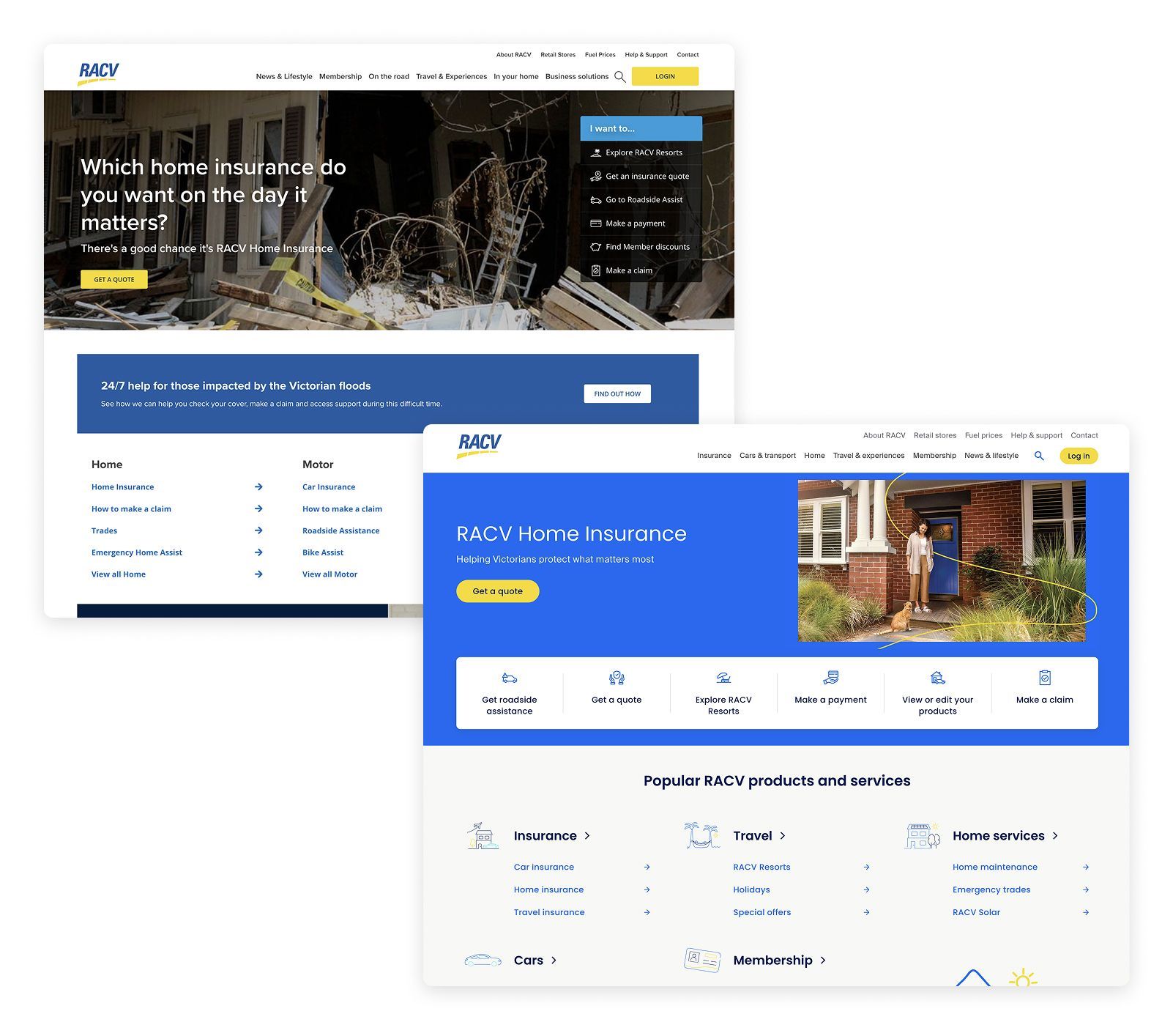
When RACV began planning a redesign of its main website and moving over to Adobe Experience Manager, it became obvious that not having a shared design system was causing problems. Teams were doing the same work twice, designs looked inconsistent across pages, and things were taking longer than they should.
To fix this and make the transition smoother, we set out to build a flexible design system that could scale easily and act as a single source of truth for all teams. It helped everyone stay aligned, work faster, and create a more consistent experience for users.
Objectives
Design System Creation: Develop a modern, scalable design system to ensure brand consistency, improve usability, and accelerate design-to-development workflows.
Component Library Development: Build a reusable, accessible component library aligned with the new design system to support rapid page assembly and reduce development redundancy.
User Experience Enhancement: Leverage AEM capabilities to deliver personalised, responsive, and user-centred digital experiences.
Accessibility (WCAG 2.1 AA) implementation
Introduce stronger accessibility features such as screenreader callouts, keyboard shortcuts, tab order sequences and many more WCAG 2.1 accessibility features.
Governance & Documentation: Establish clear documentation and governance for design and component usage to ensure long-term maintainability.
The Approach
01
Scope and Define
The process begins with clearly defining the scope to establish a strong foundation and align teams across design, product, development, and QA. This ensures a shared understanding of goals and priorities from the outset.
Next, the problem space within the design system is explored, connecting with broader business objectives to establish a unified vision. Analytics, data, existing pain points and scalability considerations guide decisions to create components that not only meet current needs but can adapt and evolve as requirements grow.
Once the scope is defined, we conduct a competitive and cross-industry analysis to gather insights and inspiration. We then begin designing in Figma, leveraging atomic components, design tokens, and established patterns where appropriate.
Designs are shared in regular critique sessions with the broader design team to gather feedback and ensure quality. Based on this input, we refine and stress-test the designs across relevant breakpoints.
After refinement, the work undergoes a two-step review: first by UX leads, then by Heads of Digital Experience. Final approval is granted once both reviews are completed and the designs meet all standards.
02
Design and Discovery
03
Design Documentation
Once the work is approved, it undergoes a final cleanup and design hygiene checks. We then begin documentation in Zeroheight, supported by visuals created in the corresponding Figma documentation files.
We document key aspects including component anatomy, variations, spacing, accessibility considerations, behaviors, interactions, and usage guidelines (do’s and don’ts).
After documentation is complete, the Design Systems Lead conducts a final review. The files are then tagged development in progress.
Once documentation is approved, a design walkthrough is conducted, attended by the development team, testing team, content producer and product. This is a chance to understand all the intricacies of the design and ask any questions.
After this it goes through story refinement, build on storybook, UX review and then AEM with UX giving final review and approvals.
Once live, we track and measure how the design performs. Looking at heatmaps, clickmaps, video recordings and Adobe analytics, to guage performance and look for pain paints and opportunties. We then iterate on the design if needed.
04
Release, Measure, Iterate


Challenges
Design System Adoption: Driving adoption of the new design system across teams with varying levels of design maturity and workflows.
We approached this early on by running insights sessions to inform teams, sitting in on design sharing sessions where UX and product designers presented their designs and advocating for certain components to be used.
We also aligned with key UX leads who approved work in the approvals process on the benefits our design system and how it helps to reduce waste, getting them onboard helped to drive adoption as designers knew their work might get bounced back if they weren't using components or tokens that reduced development work.
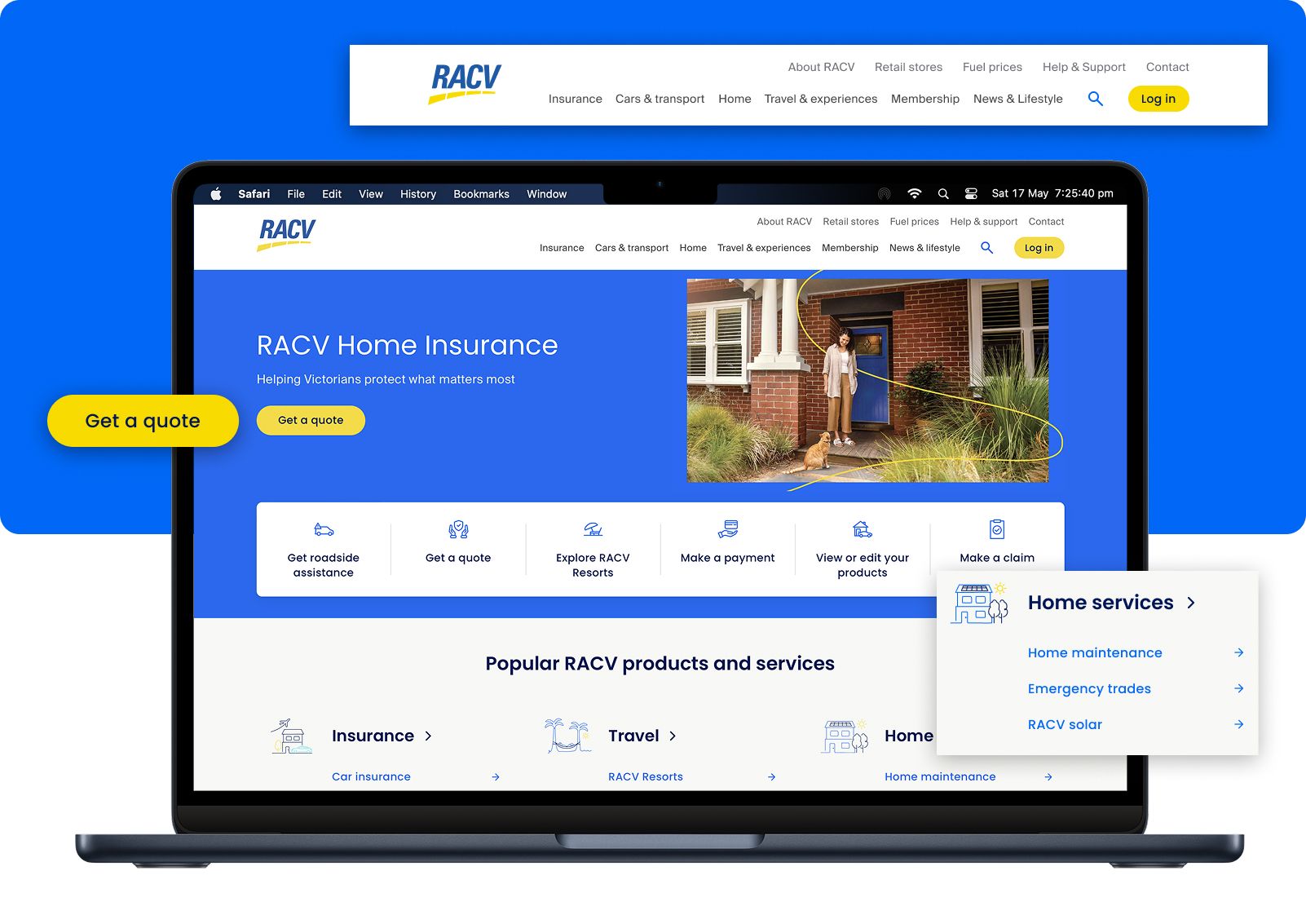
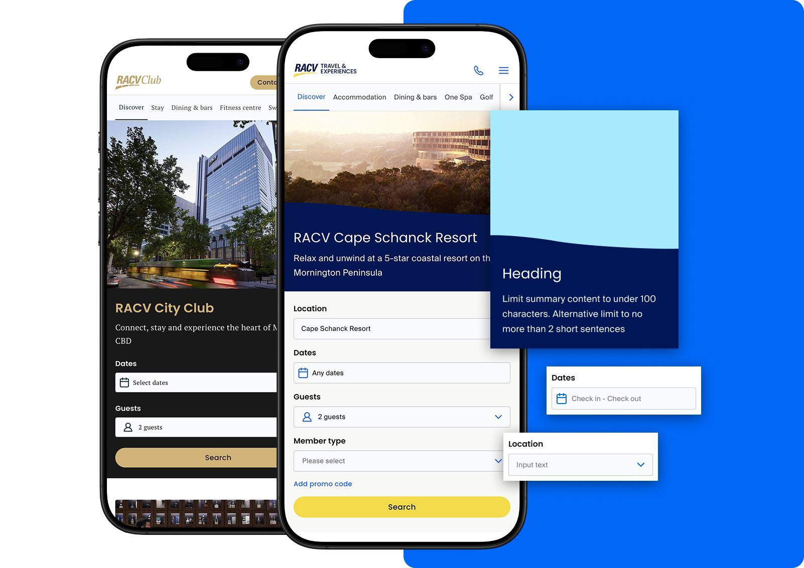
Complex business requirements: When designing complex components like the Travel and Experiences Widget, the process begins by mapping out business objectives and identifying points of alignment or conflict. Stakeholders are engaged early to prioritise needs and define flexible design patterns that can adapt over time.
Future states and potential content additions are considered by incorporating scalable layouts, modular logic, and clear guardrails within the design system. This ensures each component meets current goals while remaining adaptable as business needs evolve.
Establishing Governance: With a large design team at RACV made up of UX, product, content design and content authoring, clear governance was key to maintaining consistency and trust in the design system.
We ensured only product designers assigned to the design system squad could update core components, with all changes logged and dated in Zeroheight. This ensured traceability and alignment across teams. We also had rules around how components were to be used such as not being able to detach or edit styles of a component so it remained consistent with what had been developed on AEM.
Outcomes
Reduced UI inconsistencies by 90%: Established a cohesive visual language and interaction patterns, reducing UI inconsistencies by 90% (measured via UI audit and design review), ensuring brand integrity and seamless user experiences across all digital touchpoints.
90% Adoption rate: Fostered cross-disciplinary alignment through comprehensive documentation and governance, leading to 90% team adoption within six months and a satisfaction rating of 85% (measured by anonymous staff qualitative and quantitative surveys)
Accessibility across all components: Integrated WCAG-compliant components from the ground up, improving accessibility audit scores from 30% on the old website to 95% (validated via manual audits), broadening user inclusivity.
Increase in conversion rate: 3–7% increase in conversion rates across Insurance, Home, Trades, Travel and Experiences sections of the website (as tracked by Adobe Analytics),
The end — or maybe just the beginning?
Whether it’s just a friendly chat or a potential opportunity, feel free to say hello.